Designing and building my portfolio
I designed this site in Figma and built it myself in code, using one shared set of design tokens so the design and the build never drift apart.
- Role
- Designer and developer
- Timeline
- 4 days
- Team
- Solo
- Tools
- Figma, Next.js, shadcn, Tailwind
The goal
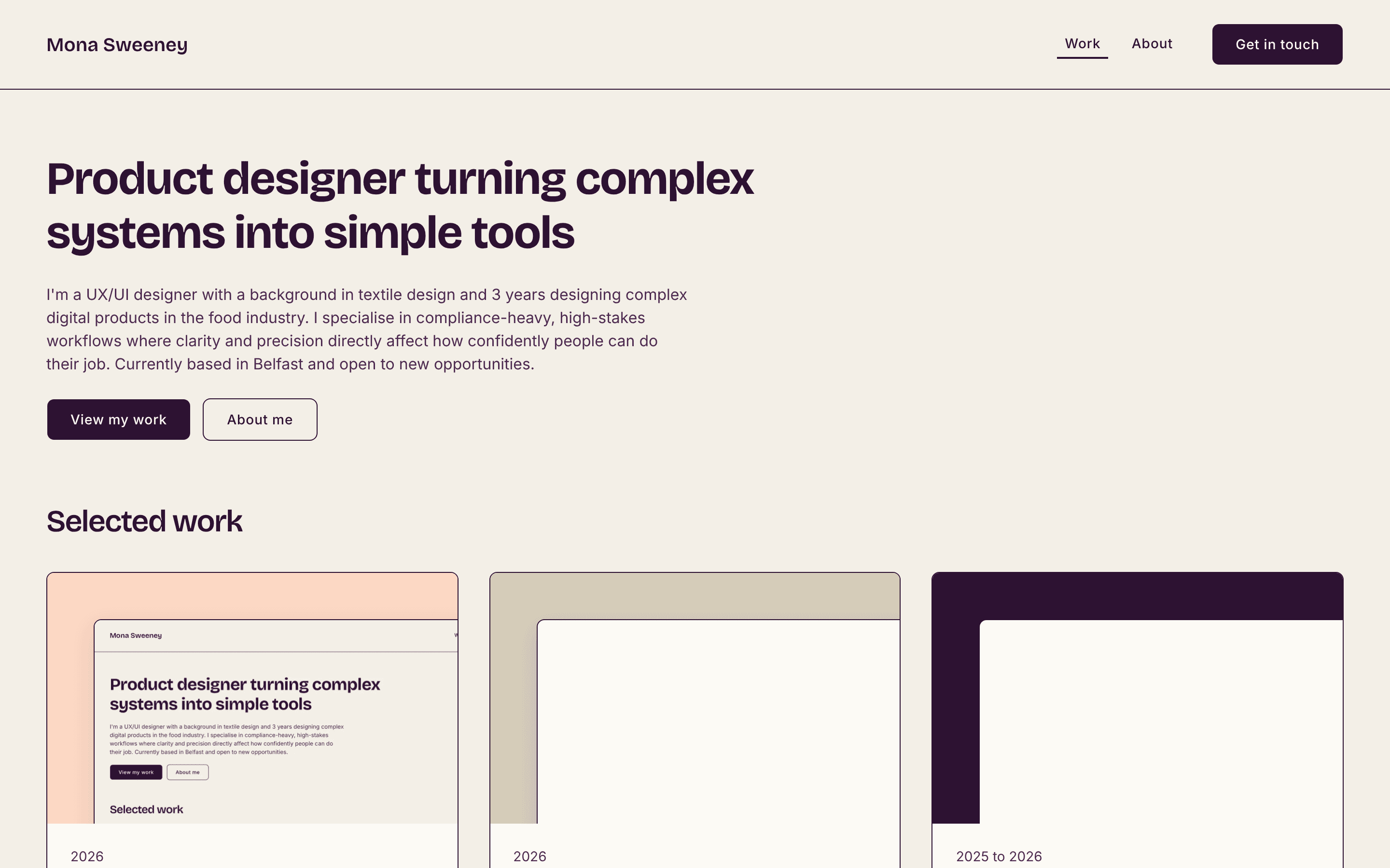
I wanted a portfolio that showed how I work, not just what I've made. As a designer working closely with developers, I wanted to understand the other side of the handoff by building the site myself, and to make design-to-code consistency part of the story.
A token system in Figma
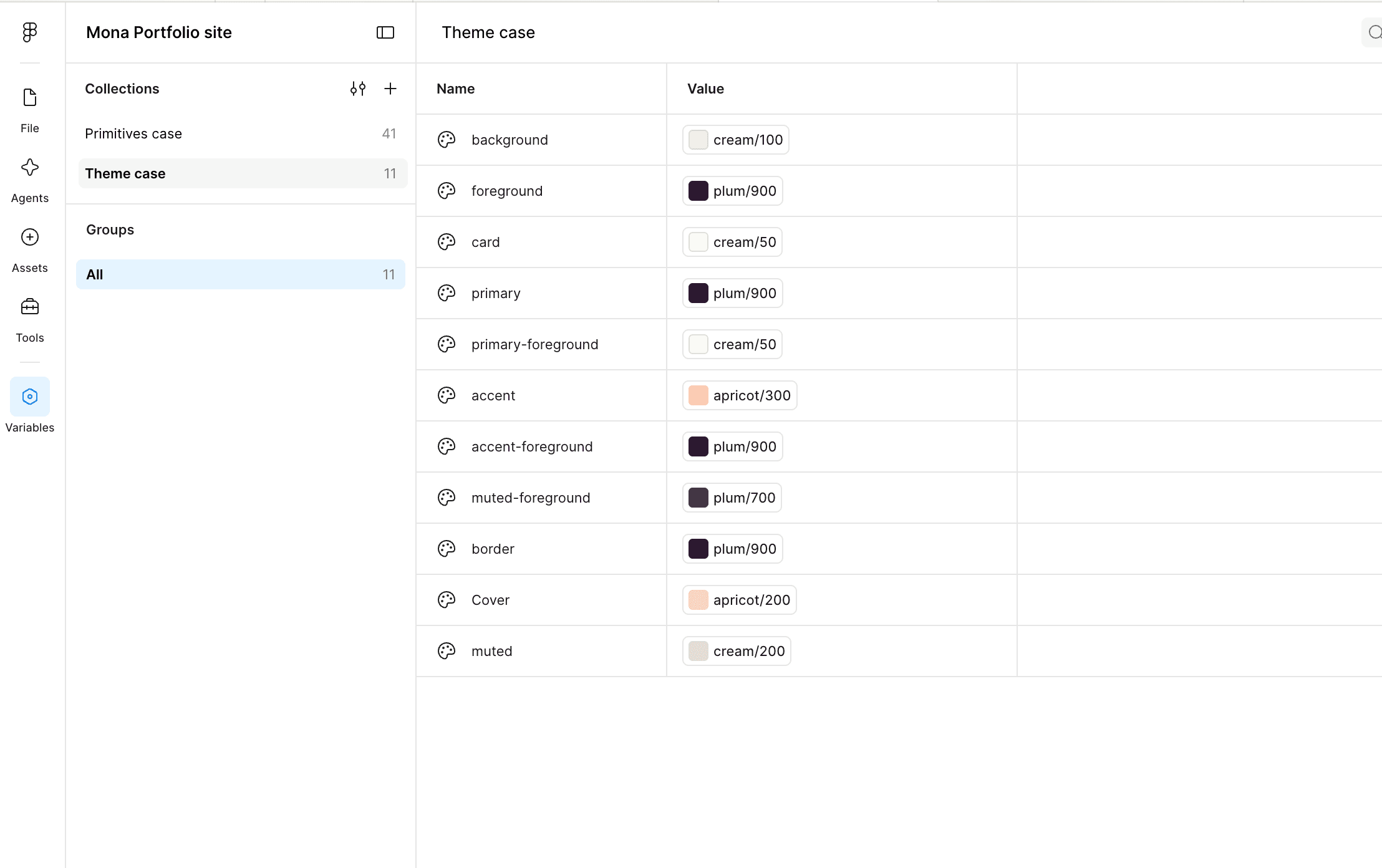
I started with variables rather than screens. A Primitives collection holds the raw values: a cream, plum and apricot colour palette, an eight-step spacing scale, radius and type values.
A Theme collection then gives them meaning using shadcn's own names, such as primary, foreground and muted, so every colour in the design maps directly to a variable in code. Scoping each variable kept the pickers clean and stopped raw values being used by mistake.
Tokenised type and components
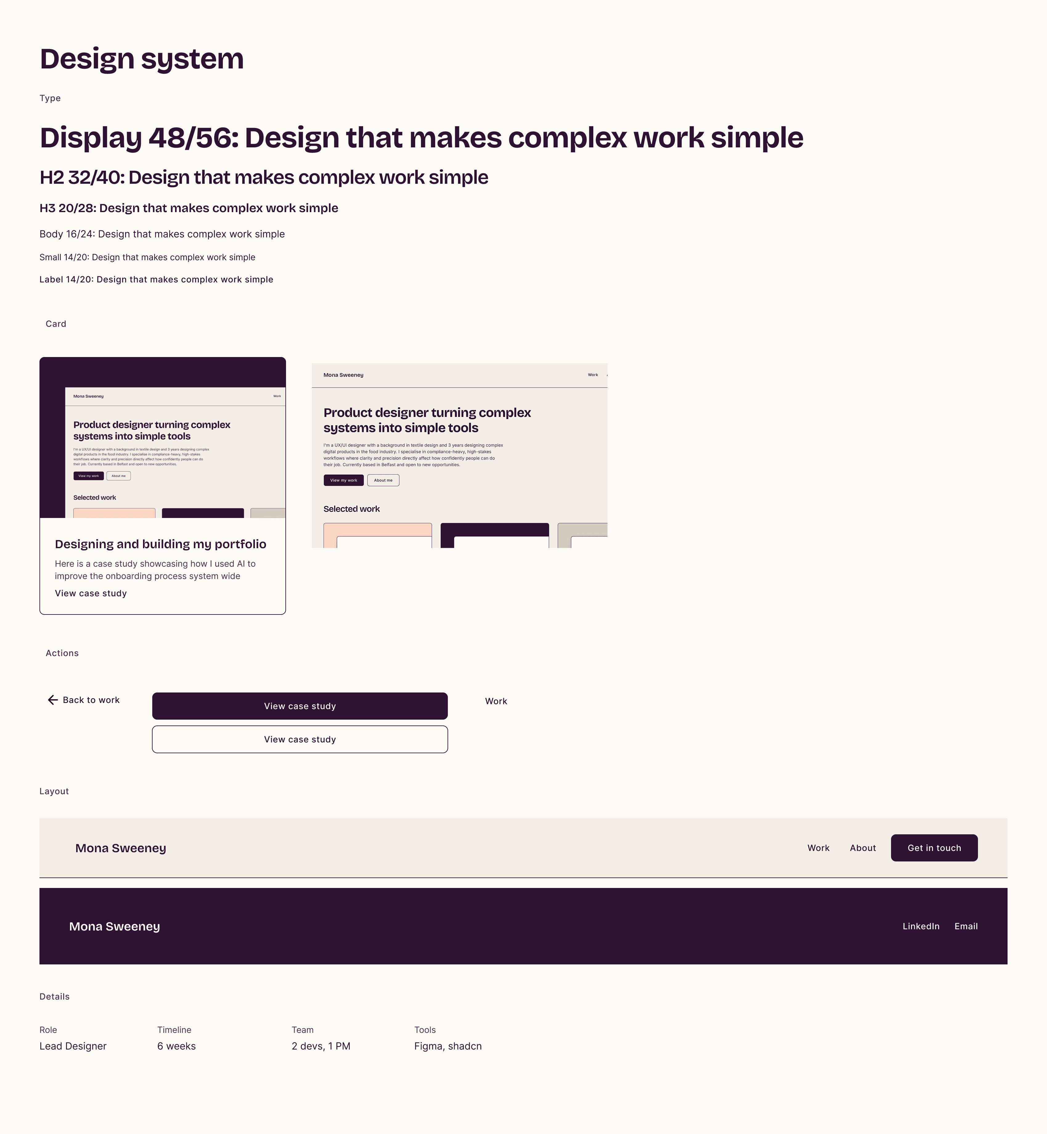
I paired Bricolage Grotesque for headings with Inter for body text, and built six text styles where every property is bound to a variable. From there I built components from the smallest up: Button, Nav link, Meta item, Cover, Case study card, Header and Footer, each with variants that mirror the props they would have in code.
Designing the pages
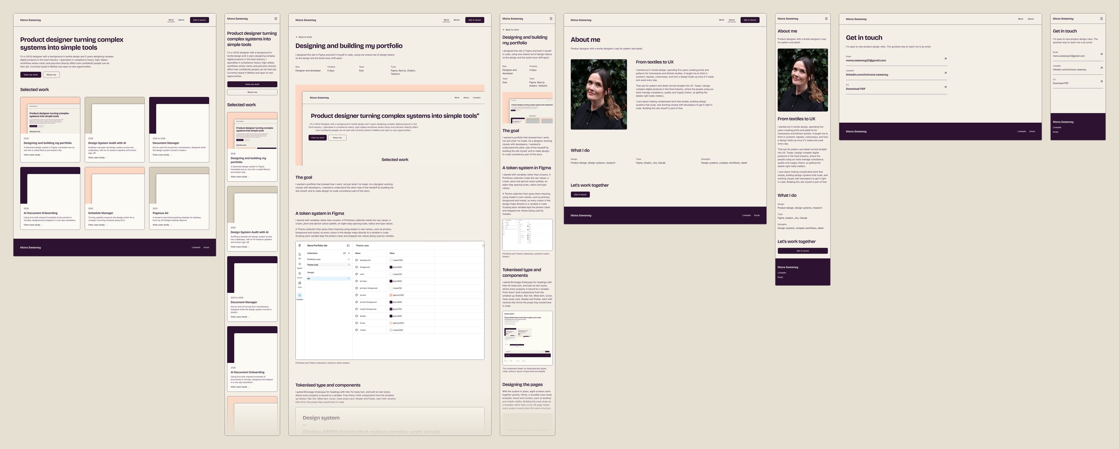
With the system in place, eight screens came together quickly: Home, a reusable case study template, About and Contact, each at desktop and mobile widths. Building the case study as a template rather than a one-off page meant every project would share the same structure.
From Figma to code
I built the site in Next.js with shadcn and Tailwind. Because the Figma variables used shadcn's naming, the colour tokens dropped straight into the CSS, and each text style became a single reusable utility.
Case study content lives in a data file, so one page template generates every project, just like instances of a Figma component. Details like a sticky header, scroll-aware navigation and crossfading page transitions were refined in the browser.
Designed for mobile too
On small screens the navigation moves into a slide-out menu built with shadcn's Sheet component. Choosing a link closes the menu first, then scrolls or crossfades to the page, so the two movements never fight each other.
What I learned
Naming is the bridge between design and code. Agreeing names early meant there was almost nothing to translate. I also gained a much better feel for how auto layout maps to flexbox and grid, why consistent spacing tokens matter, and how small details like padding stacking between sections show up in both tools. It has changed how I prepare designs for developers at work.