Pegasus Air
A research led airline booking redesign for desktop. Earlier work from my UX Design Institute diploma.
- Role
- UX researcher and designer
- Timeline
- January to June 2022
- Team
- Solo
- Context
- Student project, UX Design Institute
- 4 airlines benchmarked
- Medium and high fidelity prototypes tested
The challenge
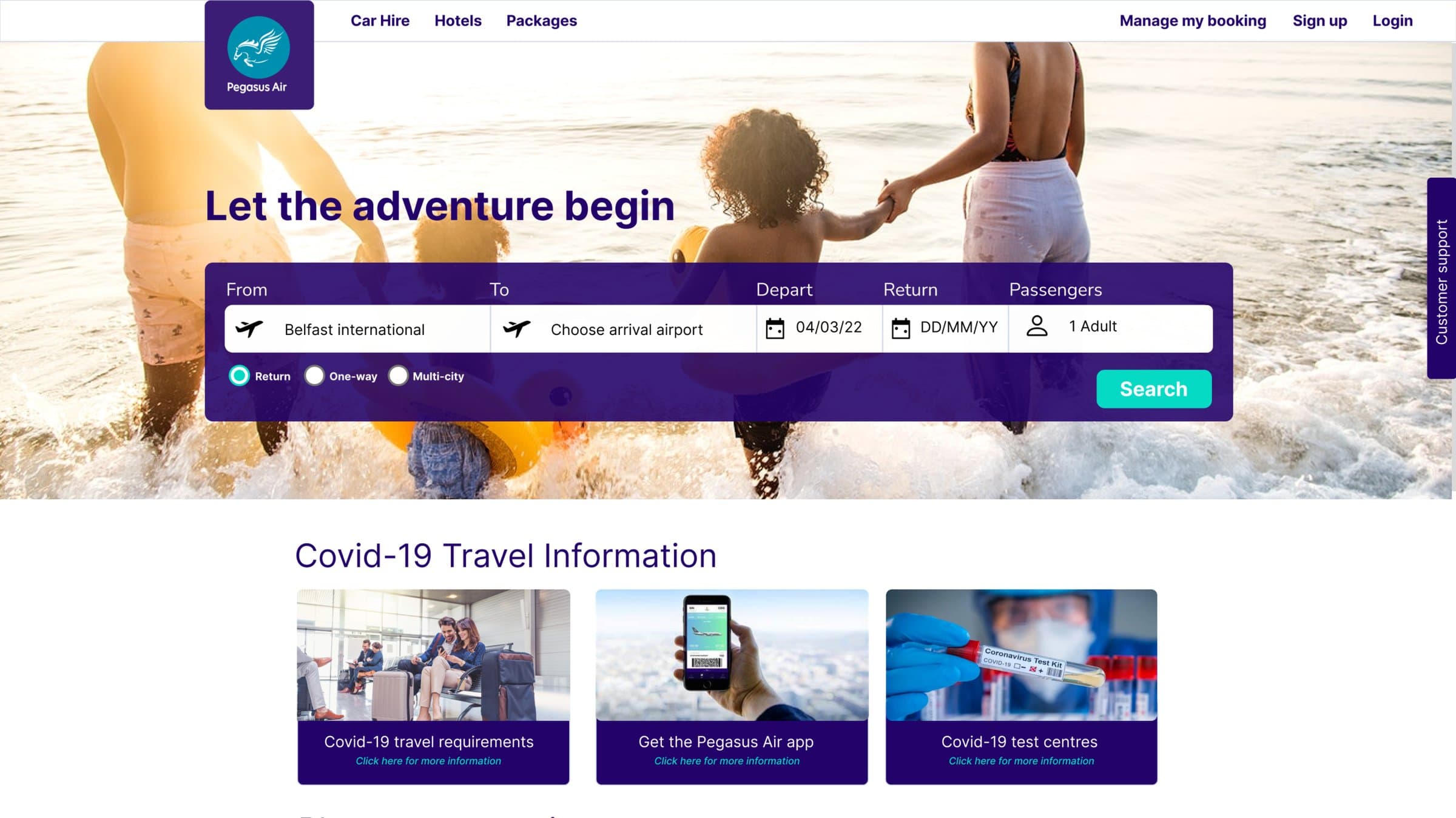
Below average conversion, weak cross selling and upselling, and drop off during booking are common problems for airlines. I was tasked with solving them as part of my diploma coursework.
Research
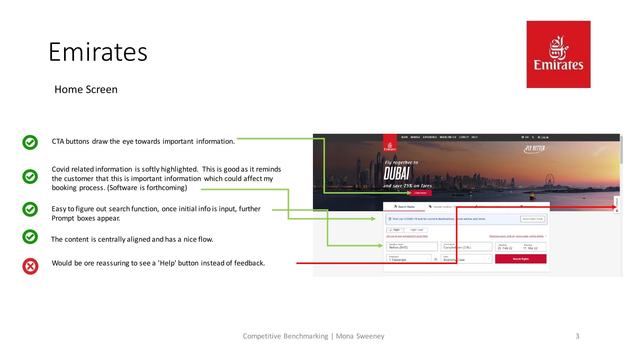
I benchmarked four airlines, a budget, a luxury, an aggregator and one non airline, ran an online survey for quantitative data, and conducted usability tests and depth interviews.
- Keep the process straightforward, with clear, high contrast calls to action.
- Most visitors are either booking or searching.
- Users search via aggregators but buy directly from the airline.
- They want their itinerary always in view.
- Many are uninterested in cross selling, seeing extras like car hire as a separate task.
Define
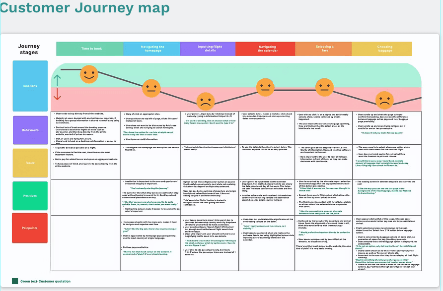
An affinity diagram and a customer journey map helped me prioritise four pain points: search flight, calendar function, fare selection and baggage, and layout and aesthetics.
Design
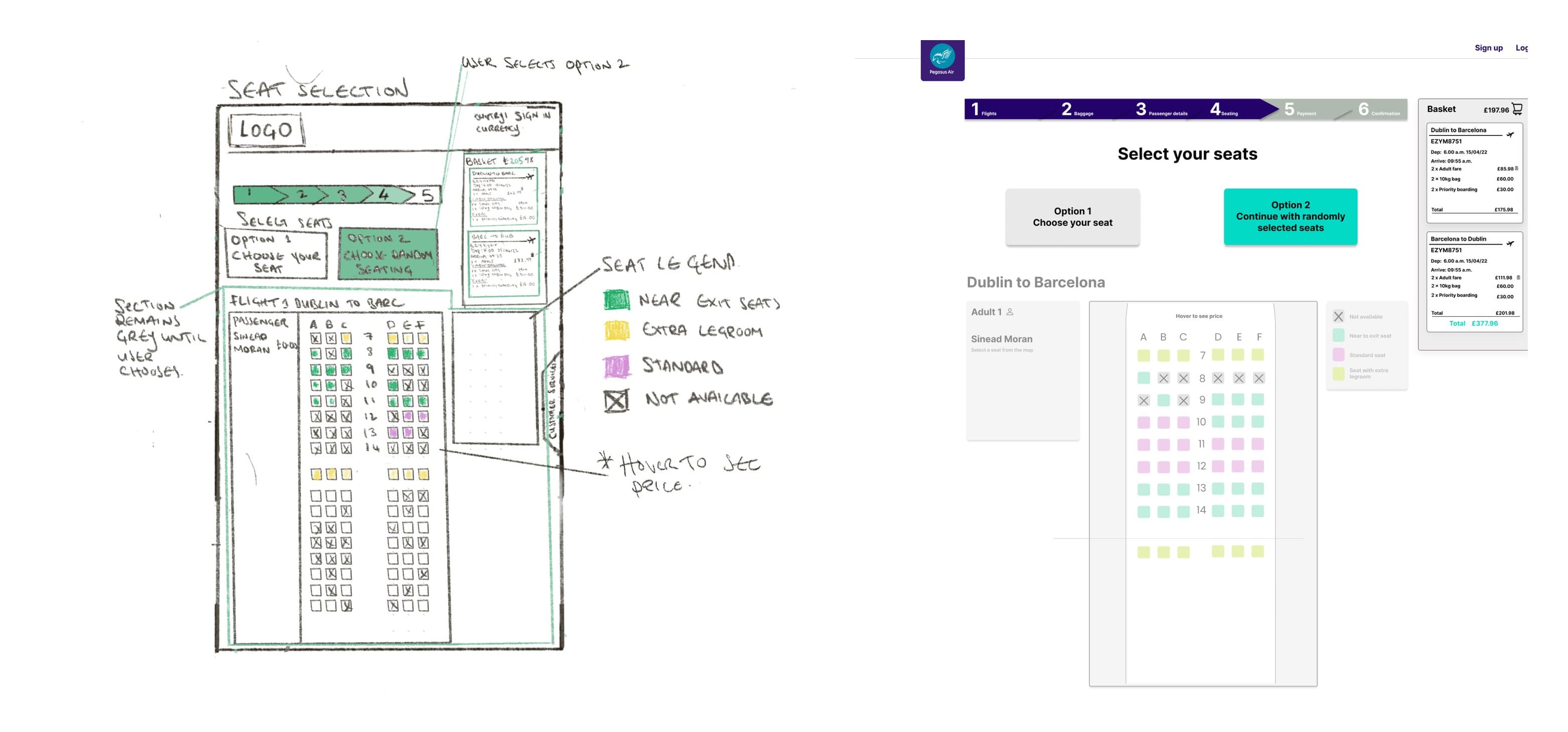
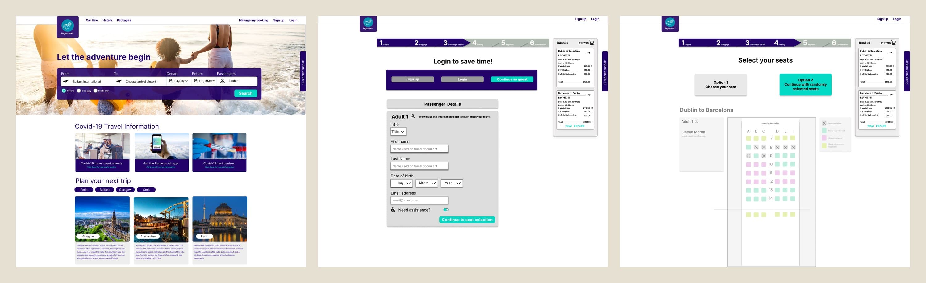
I designed a home page with a simple, high contrast search box and calendar; a fare selection page with a progress indicator and a fixed position basket so users always see their itinerary; and a build your own baggage feature with clear diagrams and pricing per flight.
Test
I built medium and higher fidelity prototypes in Figma and ran further usability tests. Users were drawn to the search box and liked the calendar dropdown, and testing surfaced blind spots: the choose your own add ons section was not obvious without scrolling, and comparing bundle pricing against add on pricing was harder than it should be.
“I like that you can see what you need to do quite quickly. From, to, search, that's what you want really.”
Outcome
A validated high fidelity prototype and a clear, evidence based rationale for every design decision. As a student project it did not go live, but it became the foundation of my UX practice.
Reflection
People want software that anticipates their needs and handles mistakes gently. Testing with real users was pivotal; it taught me that true validation comes from testing, not assumption, and left me eager to tackle these trade offs with real teams, which is exactly what I do now.